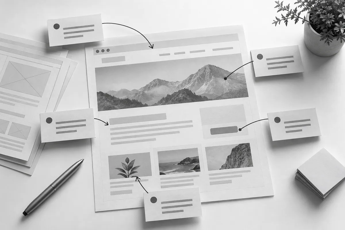
Test the journey, not the decoration
Give someone a specific task: find the right service, understand what's included and get in touch. Watch where they stop or look for an explanation. Don't point out the path right away, or you'll be testing your own explanation instead of the structure.
A prototype needs meaningful headings and roughly realistic text. Empty boxes won't show whether a long headline fits or whether the offer makes sense. The list of pages comes from the specification.
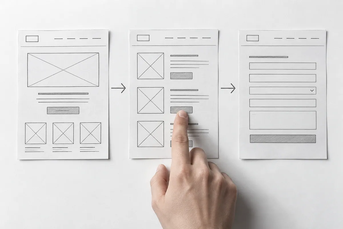
Look at alternative states
Show an empty catalog, a form error, a search with no results and a successful action. Users don't always follow the ideal path. These are exactly the states that often lack an explanation of the next step.
For the mobile version , check the priority of blocks. What sits side by side on a desktop becomes a sequence on a phone. An important condition shouldn't end up after a long decorative section.
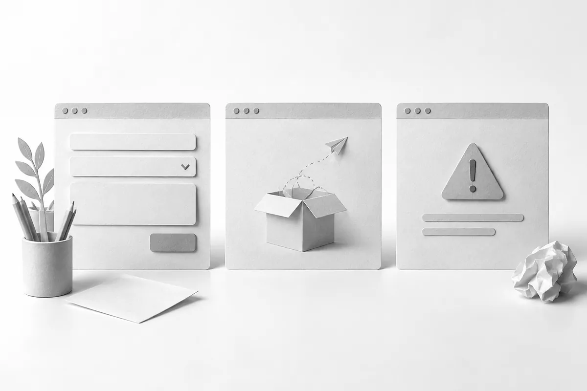
Collect feedback as tasks
Replace "I don't like this block" with a description of the problem: it's unclear what's included; you can't see where the button leads; the options are hard to compare. That way you can propose several solutions and test for the result you need.
Free website design lets you discuss the foundation of your future page. Once the logic is approved, website development builds on clear scenarios rather than assumptions that would be expensive to change at the end.