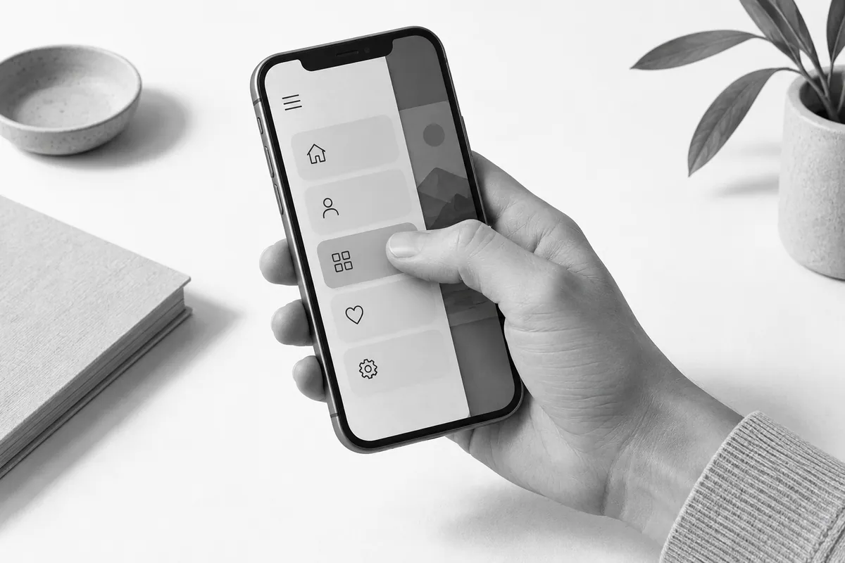
Navigate with one hand
Open the menu, the nested sections and the page you need. Make sure that expanding a submenu doesn't trigger an accidental tap through, and that closing it works in an obvious way. Anything that only appears on mouse hover needs separate behavior on a phone.
Check whether sticky bars cover the content. They can take up a large part of a small screen, especially when the keyboard opens. You can get your current website checked with a free website audit.
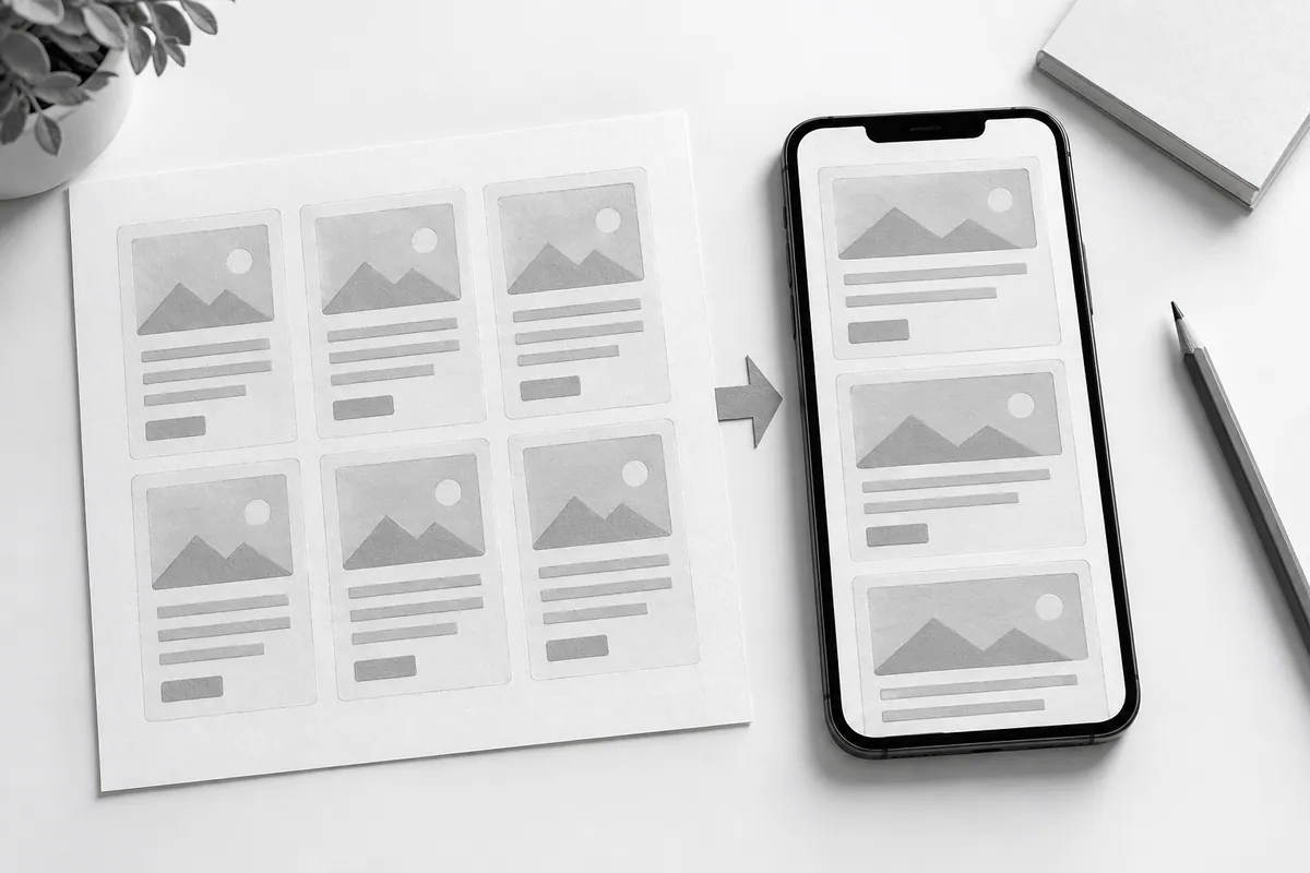
Check content order and density
When columns stack vertically, important text sometimes ends up below a long illustration. Put the main answer ahead of secondary details. You can spot this as early as the prototype. Comparisons should stay clear without constant scrolling back and forth between their parts.
Read a normal paragraph, a caption and button text on a real device. Don't make up for tiny type by expecting people to zoom in. Check long words, addresses and service names that can stretch a block.
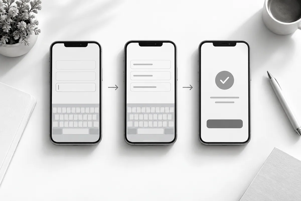
Fill in the form all the way through
Check the keyboard type, whether labels stay visible, error messages and whether typed text is preserved. After the tap, it should be clear whether the action is in progress, finished or needs to be repeated. Which fields to keep: website lead form.
During website development, mobile scenarios are part of acceptance testing. Technical support helps repeat them after changes to menus, forms or widgets that can affect a small screen.