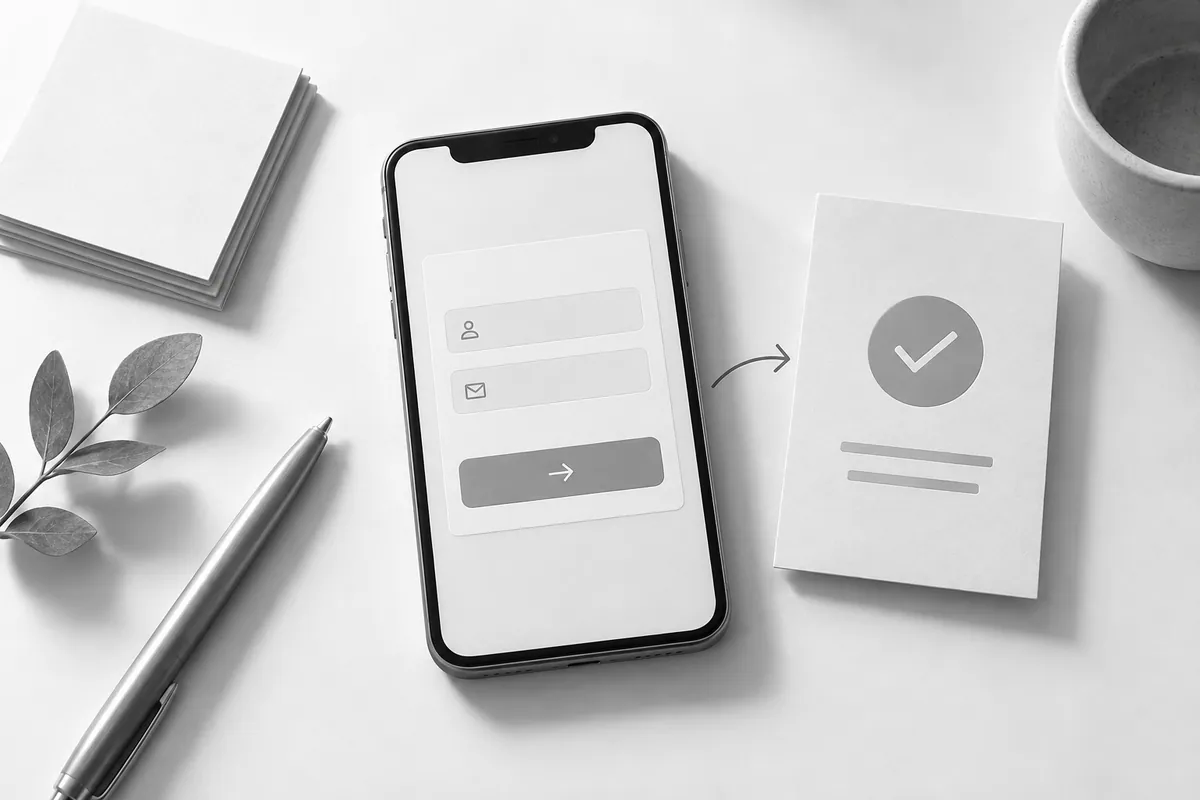
First screen: name the offer and who it's for
The headline should explain what you do and for whom. The subheading can clarify the result or where the offer applies. Abstract words about innovation make people guess what the service is. The button should name a real next step: discuss your project, get a quote, book a time.
If the button opens a form, don't promise an instant price when a sales rep has to calculate it. The button and what happens after it need to match from the very first screen. The image should help people understand the product, not push the explanation further down. For ads, there's a separate ad landing page checklist.

Middle of the page: from use cases to terms
Show the situations where the service makes sense and what the customer gets at the end. The result and the list of tasks are not the same thing. "Form setup" describes what the contractor does; "the inquiry reaches the right sales rep" explains the benefit.
Next to that, lay out the scope and limits of the work. Two columns or compact cards make comparison easy. Don't tuck important exclusions away at the bottom of the page. Buyers should understand the offer before they hand over their contact details.
Trust without made-up proof
Use real product demos, explanations of your process and samples of results you have permission to show. If you don't have case studies yet, it's better to show in detail how work gets approved and what is checked at the end. Fake reviews and numbers are no substitute for evidence.
Each stage of work should have substance: what you need from the client, what decision gets made and what they receive after that stage. Labels like "brief, design, launch" on their own do little to help someone judge what working with you will be like. You can test the structure early with a free website design.
The close: remove obstacles before the request
The FAQ should answer real objections, and the form should ask only for what's needed for the next contact. Don't repeat the same form after every section. On a long page, you can add several buttons that lead to one clear contact point.
Check the landing page on a phone: does the image take up the whole screen, are the terms readable, are there long empty gaps? Landing page development starts with this path. If the page will work with ads and a CRM, connect it to a lead handling system from the start.